Trending Wedding Colors for 2026: A Complete Guide to Modern Palettes
For the last decade, the wedding industry has been dominated by a single, safe color palette: white and green.
Couples, terrified that their wedding photos would look "dated" in twenty years, opted for the most neutral aesthetic possible. White roses, green eucalyptus, white linens, and beige bridesmaid dresses. It was beautiful, safe, and eventually... ubiquitous.
But as we move into the 2026 wedding season, a massive shift is occurring. The fear of "dated" has been replaced by the desire for "distinctive." Couples are realizing that color is the fastest, most effective way to inject personality and emotion into an event space.
This year, color is back. But it is not the matching, overly coordinated "David's Bridal teal" of the early 2000s. The new approach to color is sophisticated, layered, and deeply atmospheric.
If you are planning your wedding, your color palette will dictate everything from your floral budget to your rental chairs, and importantly, the design of your wedding website. Here are the four dominant color palettes defining the 2026 wedding season, and exactly how to execute them without your wedding looking like a themed birthday party.
1. The "Sunset Tuscan" Palette: Terracotta, Ochre, and Dusty Rose
If there is one color defining modern romance right now, it is terracotta. This earthy, baked-clay color brings an immediate sense of warmth and grounded luxury to any space.
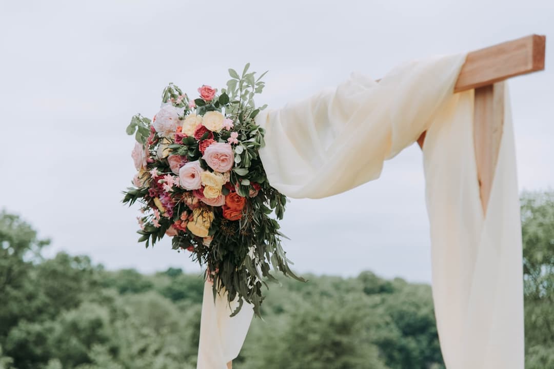
Rather than pairing it with stark white, the 2026 approach is to layer terracotta with its color-wheel neighbors: golden ochre, dusty rose, and muted peach. The result looks like a sunset over a Tuscan vineyard.
How to Execute This Palette:
- Florals: Skip the standard white roses. Ask your florist for rust-colored amaranthus, toffee roses, and dried elements like bleached fern or pampas grass for texture.
- Linens: Use textured, raw-edge linen runners in dusty rose or mustard over bare wooden tables.
- Fashion: This is the perfect palette for the "mismatched bridesmaid dresses" trend. Have your bridal party choose silk slip dresses in varying shades of rust, copper, and peach.
- The Vibe: Warm, inviting, and effortlessly bohemian. Perfect for late summer and early autumn weddings.
2. The "European Garden" Palette: French Blue, Chartreuse, and Crisp White
This is the "Old Money" aesthetic translated into wedding design. It is preppy, fresh, and deeply elegant without feeling stuffy.
French blue (a soft, slightly grey-leaning blue) acts as the neutral base, while chartreuse (a vibrant yellow-green) provides a modern, unexpected pop of acid color. It feels like a garden party at a chateau in the south of France.
How to Execute This Palette:
- Florals: This is where you use white. Fluffy white hydrangeas, white sweet peas, and vibrant, structural green foliage. No muted eucalyptus here—you want the bright, vibrant green of freshly cut stems.
- Tabletop: French blue water goblets, crisp white linens, and taper candles in chartreuse.
- Stationery: Thick, white cotton paper with French blue letterpress and a vintage botanical envelope liner.
- The Vibe: Crisp, aristocratic, and joyful. Ideal for spring weddings and historic estate venues.
3. The "Moody Elegance" Palette: Espresso, Champagne, and Forest Green
For evening weddings and winter celebrations, the light and airy pastel palettes simply do not work. You need colors that hold their own in dim lighting and candlelight.
In 2026, black is being replaced by Espresso—a rich, deep brown that feels warmer and more luxurious than stark black. Paired with the metallic warmth of champagne and the depth of forest green, this palette feels like an exclusive, high-end supper club.
How to Execute This Palette:
- Attire: A velvet espresso tuxedo jacket for the groom. Champagne satin dresses for the bridal party.
- Lighting: This palette relies entirely on lighting. You need hundreds of candles. Skip the harsh overhead venue lighting and use amber uplighting.
- Florals: Lots of dark, structural greenery (like smilax), paired with deep burgundy or chocolate cosmos, and champagne-toned orchids.
- The Vibe: Intimate, sexy, and incredibly luxurious.
4. The "Monochrome Texture" Palette: All Sage, or All Ivory
If you genuinely dislike bold colors, there is a modern way to do a neutral wedding: the Monochrome Texture approach.
Instead of mixing two colors (like white and blush), you choose exactly one color and use it in ten different textures. For example, an all-sage wedding. The bridesmaids wear sage chiffon. The tables have sage velvet linens. The plates are sage ceramic. The candles are sage wax.
How to Execute This Palette:
- The Rule of Texture: Because you are only using one color, you must vary the materials. If everything is the same shade of flat cotton, the room will look flat. Mix velvet, silk, matte ceramic, and glossy glass.
- Florals: Work with your florist to find flowers and foliage that perfectly match your chosen tone. An all-green floral installation (using no blooms, only varying textures of leaves and vines) is a massive trend for 2026.
- The Vibe: Architectural, minimalist, and incredibly chic.
How to Apply Your Color Palette (The 80/20 Rule)
The biggest mistake couples make with color is applying it evenly across everything. If your colors are Blue and Yellow, and you alternate blue napkins with yellow napkins, your wedding will look like a corporate event.
You must use the 80/20 Rule.
Choose one color to be your dominant base (80% of the visual space). This should be a softer, more muted color. Then, use your second color as the accent (20% of the visual space) to provide contrast.
For example, in the French Blue and Chartreuse palette:
- 80% French Blue: The table linens, the bridesmaid dresses, the invitation envelopes.
- 20% Chartreuse: The taper candles, the signature cocktail garnish, the ribbon on the bouquets.
It Starts With Your Website
Your color palette doesn't start when guests walk into the reception hall. It starts the moment they open your wedding website.
Your website sets the psychological expectation for your event. If you are having a moody, espresso-toned evening wedding, sending guests to a bright, floral-patterned website creates a disconnect.
When you choose a website platform, you need the ability to customize colors to match your specific vision, ensuring that from the first click to the final dance, your wedding feels cohesive.
Find Your Perfect Match
Ready to see how your colors will look on screen? Wedflip offers over 120 premium templates categorized by color palette and vibe. Whether you are planning a Tuscan sunset celebration or a moody winter gala, there is a design built perfectly for your aesthetic.